Tagged: design
Typography primer #
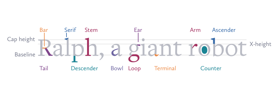
Joshua Ogle wrote an excellent intro to typography, a topic of which every developer should have a basic understanding.
Trailing Conditionals Considered Harmful Unless Used Sparingly #
Thoughtful post about trailing conditionals in Ruby from Jerod and how to make code readable, scannable, and obvious.
Code is read much more often than it is written, so we need to optimize for readability over writeability. Trailing conditionals tend to do the opposite.
Reminds me of a sign I used to see in a front yard on my daily commute when I lived in the Houston area. It read: GARAGE SALE when flashing.
New Android design site #
Part style guide, part platform UI overview, the new Android Design site is fantastic. Ice Cream Sandwich is substantially more polished than previous versions of the platform. While I'm dubious of whether Android will ever approach the level of refinement of iOS, this new design guide is a clinic in building a UI standards reference, an indispensable asset for an application team.
Responsive web design and the role of Photoshop #
Trent Walton, at the end of a larger piece on using media queries to detect screen height to adjust font size:
We’re leaping past any point where the word webpage makes any sense, and into a world where what is seen at any one screen size (or Photoshop comp) only captures a sliver of the display capability responsive websites muster.
I wonder if Responsive Web Design will diminish the role of Photoshop in the design process. It's hard to argue that the Adobe product dominates the industry, but my use has diminished over the years. Since modifying layouts in Photoshop is just plain tedious, Photoshop has been reduced to a stopover between Illustrator and the assets folder of my web project, lingering just long enough to get an adjustment layer (or two) and some layer effects.
Now, if in this brave new world designers need to create comps for multiple pages at different screen resolutions, I think the designers who can work in the medium of HTML+CSS will come out on top.

The Noun Project - “sharing, celebrating and enhancing the world's visual language” #
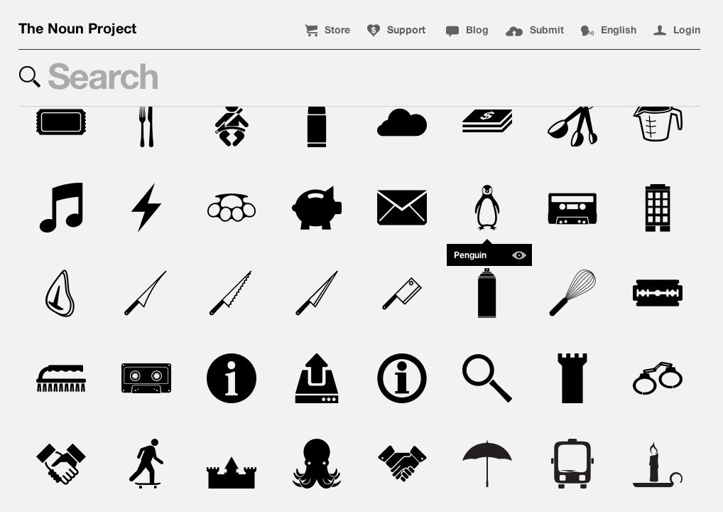
A fantastic collection of high quality monochrome icons released under Creative Commons license. They look great on tee shirts or iPhone cases.
Explain Responsive Web Design to your client, boss, etc. #
James Mellers demonstrates Responsive Web Design in a fun, animated illustration..
Nice collection of body typefaces #
There is a growing list of great looking typefaces on Google's directory, however most look better for headlines. Ross Johnson has put together a list of great typefaces for body copy, explaining his selection criteria in his blog post.
Unless you're reading this in your newsreader, you're enjoying Bitter.
It shouldn't be this easy #
Keith Gaddis in a thoughtful take on Steve Klabnik's provocative piece on Rails' shortcomings:
This is mostly my opinion, but a lot of us let our rejection of enterprise culture lead to rejection of “enterprisey” design patterns, many of which developed in order to solve problems we’re now encountering in the Rails world as we tackle problem domains that are not only non-trivial but exceedingly complex.
Perhaps we in the Rails community have been too quick to throw out the baby with the bathwater, but it was a knee-jerk reaction to over-architecture, not a rejection of Enterprise culture. When I came to Rails, Microsoft was telling us we needed six layers of indirection between the UI and the database. ActiveRecord was a common sense approach that fit nicely for eighty percent of web apps. I think it still does. For the twenty percent of apps with more complexity, there's a host of Rails plugins and a vibrant Ruby ecosystem beyond Rails.
If there’s one overriding idea from the Rails world that I think should be promoted far and wide, its this: it shouldn’t be this hard.
That's the drive behind all innovation, isn't it? I just hope in the quest to improve, we don't lose sight of the big picture. There has never been a better time to be a developer, web or otherwise. We indeed have an embarassment of riches. Development will always be hard. But it shouldn't be this easy.
Design icebergs #
Braden Kowitz in a thoughtful piece on design details on Design Staff:
Designing a custom button in Photoshop is easy — that’s the part of the iceberg we can all see. Below the surface it takes a lot of effort to get the details right: building pressed and inactive states, preventing text highlighting on double-click, adding right-to-left support, testing accessibility, and so on.
I often hit this iceberg when I stray from native controls. For example, Ajax interactions require more polish than basic web pages. Custom mobile menus require more polish than the built-in version. If the team doesn’t have the time to polish custom UI, it’s often better to stick to the boring native controls that work.
Custom controls can really add to the experience, but they're not cheap. Buttons are one thing. Dropdown menus are another. If you have to do it, libraries like Nathan's Formalize are a great head start.
Learn the Illustrator pen tool step-by-step #
Veerle has created a great step-by-step tutorial for mastering the pen tool in Illustrator in both CS5 and CS4/3 flavors.
Font design - from vision to sketch to reality #
Ludwig Übele writing for I Love Typography:
I had in mind this idea of a wide and flat landscape. This was the initial idea: Tundra should lead the eye effortlessly along the line, thus emphasizing the horizontal.
Nice-looking serif face that delivers on that initial vision.