Tagged: typography
linked
Typography primer #
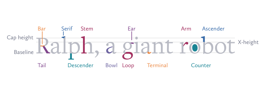
Joshua Ogle wrote an excellent intro to typography, a topic of which every developer should have a basic understanding.

linked
Nice collection of body typefaces #
There is a growing list of great looking typefaces on Google's directory, however most look better for headlines. Ross Johnson has put together a list of great typefaces for body copy, explaining his selection criteria in his blog post.
Unless you're reading this in your newsreader, you're enjoying Bitter.
linked
Font design - from vision to sketch to reality #
Ludwig Übele writing for I Love Typography:
I had in mind this idea of a wide and flat landscape. This was the initial idea: Tundra should lead the eye effortlessly along the line, thus emphasizing the horizontal.
Nice-looking serif face that delivers on that initial vision.